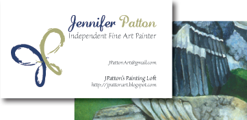
Symbol for Jennifer Patton: Freelance Painter
Logotype and Business Card for UPtimizm

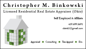
Combination Mark for Christopher Binkowski: Real Estate Appraisor
Created card to stand out from others, while maintaining a consistency with the industry. Real estate appraisal is one of the key steps taken when buying or selling property. To show Mr. Binkowski's definitive roll in this process, his initials become the building blocks for the house icon on this card. The house won't be complete without the blocks needed to fit into his initials, illustrating that one would need Chris Binkowski to appraise their real estate before they could properly buy or sell.
Book Cover Design for Chuck Hester
This book cover was designed for networking guru and President at Chuck Hester Enterprises, Mr. Chuck Hester. His book is all about his experience/success with paying it forward. He hosts networking events for individuals to meet in person that are connected via an online networking website. The background image of the cover represents computer networking, and the ambiguous figures represent making that human connection through Chuck's mission.

Book Cover Design for Stephanie Hester
Author, speaker, and consultant; Stephanie is the Principal and Founder of Stephanie Up Front. In this book she takes readers through her personal experiences in hopes of inspiring her audience to Choose a Better Life. What better image to show that bliss, than this photo of the author on the front cover?

Book Cover Design for Dave Baldwin
Author, and freelance writer and editor; Dave Baldwin is The Introverted Entrepreneur. The title "Pied Piper" can come with a bad connotation, so along with the challenge of designing a pleasing layout, this cover needed an image that would reverse the negative undertone of its title. The image conveys figures being led out of icy and turbulent waters; Therein stating that the author will lead the reader from their current agitating situation to achieving their entrepreneurial goals.

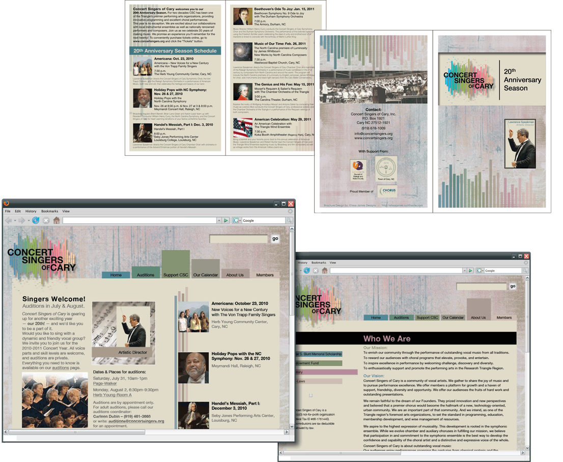
Logotype, Web Template, and Brochure Design for the Concert Singers of Cary
The Concert Singers of Cary are a community of vocal artists. They gather to share the joy of music and to pursue performance excellence. They offer members a platform for growth and a haven of support, friendship, diversity and opportunity. Offering their audiences the fruits of hard work and outstanding presentations.
Plenty of colors are used here to represent the diversity of the singers and their dazzling performances. The bars in the mark represent such lines that can be seen on a sound meter on a stereo system. It’s meant to stray from using cliches like music notes and instruments, which can become overused in the musical market.
Visit their site at: http://concertsingers.org/
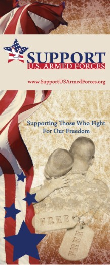
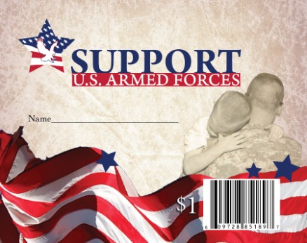
Logotype and Brand for Support U.S. Armed Forces
Support U.S. Armed Forces is a Non-profit organization raising money for all military branches, and was founded locally in North Carolina. I have been working with SUSAF since their conception, and have continued to build their brand. I've worked on business cards, care package designs, brochures, retail donation ribbons, banners, etc. The military is very near and dear to my heart, and I do everything I can to contribute. I'm honored to work with this organization.
www.supportusarmedforces.org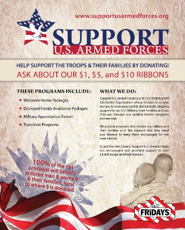
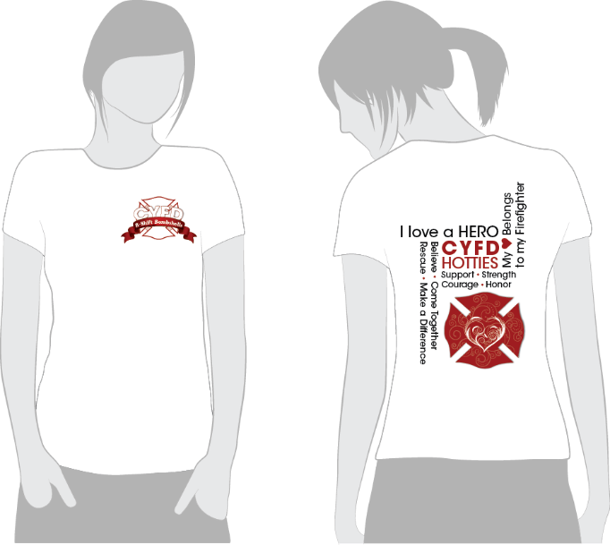
Tshirt Design for CYFD, B-Shift Bombshells
CYFD (Central Yavapai Fire Department) is located in Arizona. The women of the Fire Department wanted a Tshirt to wear in support of their Firemen.
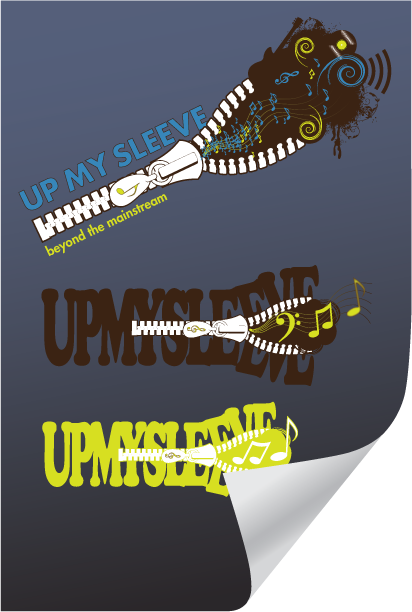
Logo and Symbol Design for Up My Sleeve
Up My Sleeve is a multi-purpose music and arts company that exists to love, share, spread, promote and experience music, bands, films, concerts and more. The client will strive to uncover, and share with it's audience real talent, passion, and unique artistic experiences. That being said, this logo was created to show their eclectic style.
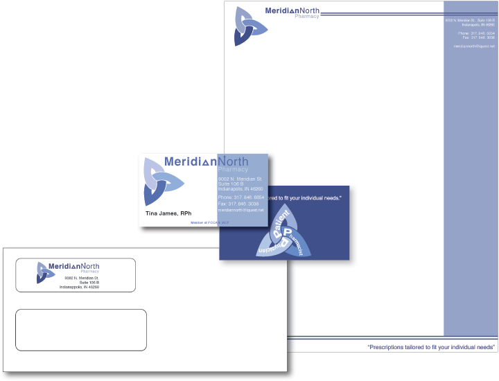
Identity System for Meridian North Pharmacy
Meridian North's mission is to tailor prescriptions to each individual customers' needs. As such their symbol is designed to substantiate their mission of putting the customers first. The top point of the symbol represents the patient, while the bottom two points of the triangle represent the pharmacist and physician, on an equal level, serving the patient.
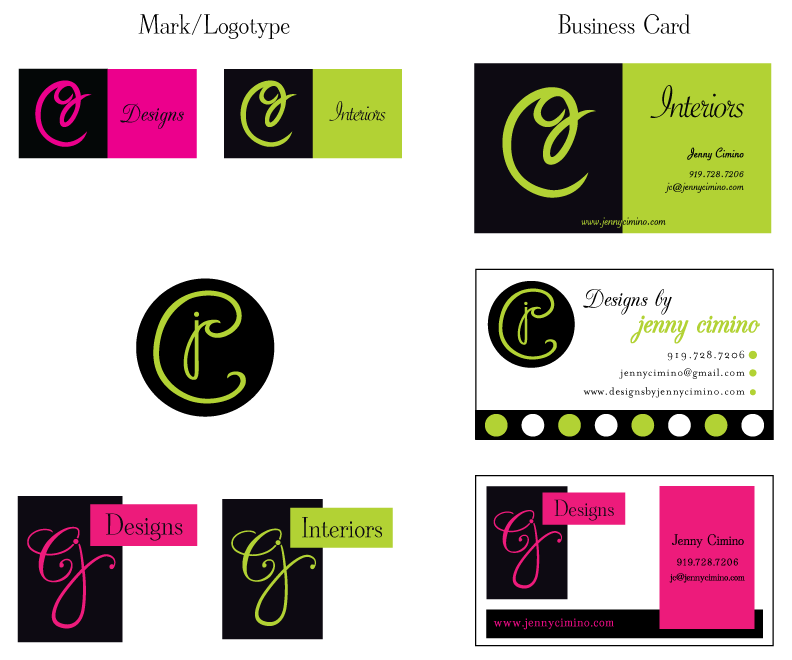
Mark, Logotype, and Business Card Design for Jenny Cimino
Jenny Cimino is currently an Interior Designer looking to broaden her creative gift. She wants to eventually expand to fashion, specifically shoes. Mrs. Cimino needed a mark that could be used across the board with only color separating the industry. Below are the options presented to her.
All designed images and text © Elissa James 2012