Click the thumbnails to enlarge.
Adobe Creative Suite3: Direct Mailer
Currently, Adobe's main audience is business professionals. This mailer is intended for residential areas in hopes of expanding their audience to family homes. This mailer advertises Adobe products' abilities to enhance priceless family photos, and create mess-free scrapbooks/photo albums. Each page highlights a program within the suite, and on the last page there is a demo CD of the programs included in Adobe Creative Suite3.
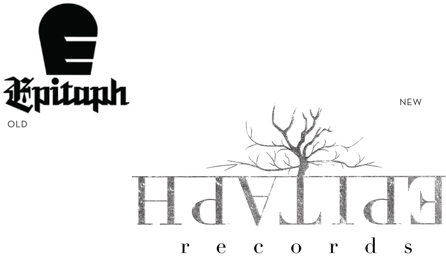
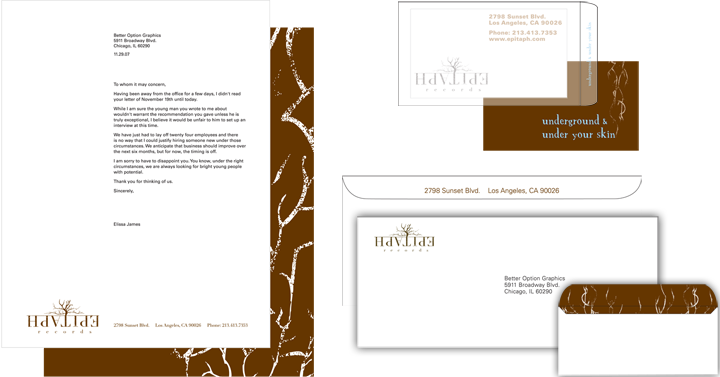
Logotype and Brand Management for Epitaph Records
Epitaph Records claims to sign a wide range of musical genres to their label, but with their company name meaning: "inscription on a tombstone," they find it hard to appeal to any genre other than heavy metal or hard rock bands. This redesign aims to diversify them, by branding them as "underground."
Their logo is a serif typeface with a grainy texture to emulate that of a tombstone; Their music is underground and gets under your skin, which is conveyed by the roots (underground) and veins (under your skin) growing up from the company name. This growth is mirrored in the growth of their company.
*Won Best Design - 2007
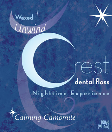
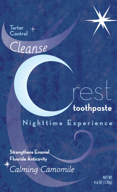
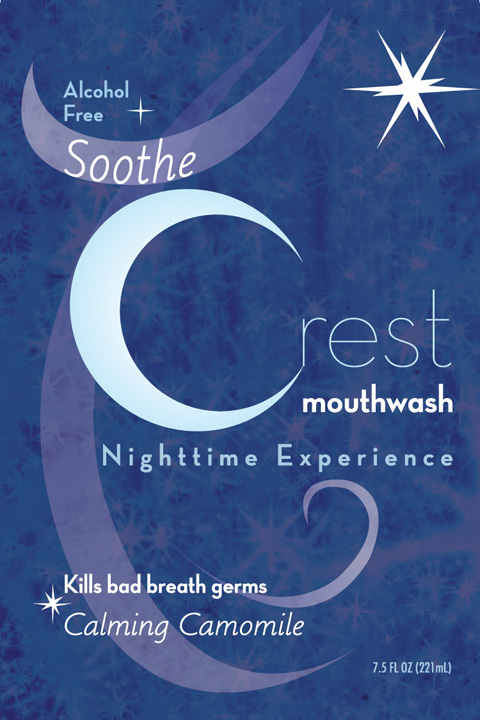
Product Line & Package Design for Crest
The Fall Asleep with Crest product line was created to make nighttime hygiene something everyone looks forward to. The crescent moon shape doubles as the "C" in Crest. The flavor is "calming chamomile," used for its aromatherapy and ability to induce a sleepy feeling. Unwind after a long day as you unwind the Crest dental floss. Cleanse your mind as you cleanse your teeth with Crest toothpaste. Soothe yourself with soothing Crest mouthwash. Sweet Dreams!
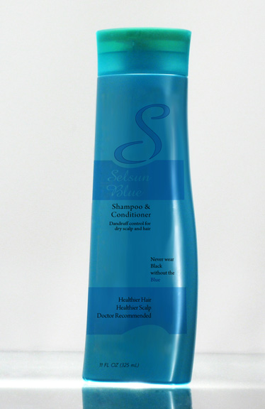
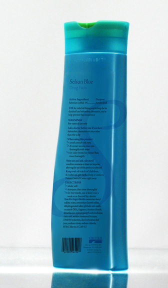
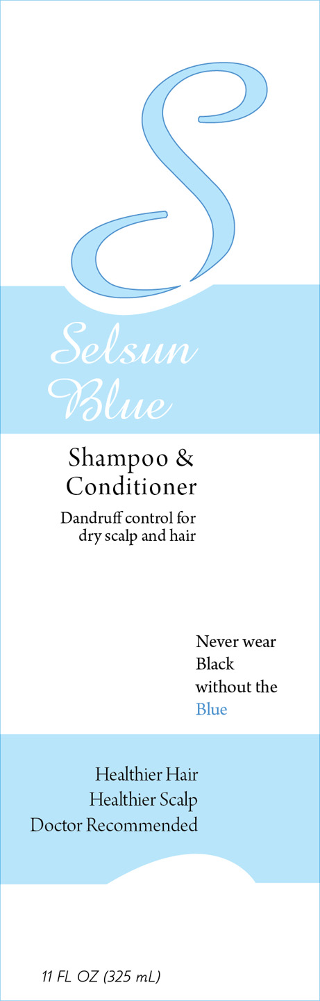
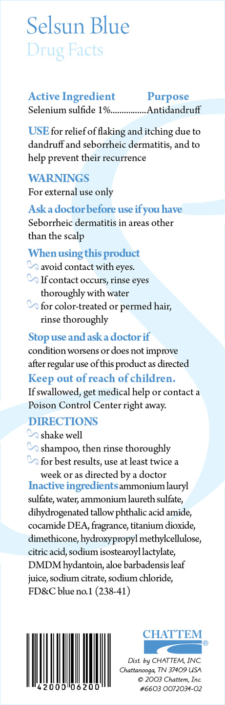
Product & Package Redesign for Selsun Blue
Who wants to advertise that they have dandruff with that opaque, royal blue Selsun bottle? This redesign mimics higher end hair products, so that buyers can feel comfortable walking out of a store with a dandruff shampoo. The stylized "S" and matching curvaceous shape of this bottle scream chic, while keeping the medicinal purpose of this shampoo intact. The bottle still sports an opaque color, a more beautiful, iridescent blue, to keep natural light from effecting the therapeutic ingredients inside.
All designed images and text © Elissa James 2016