UNDER CONSTRUCTION...
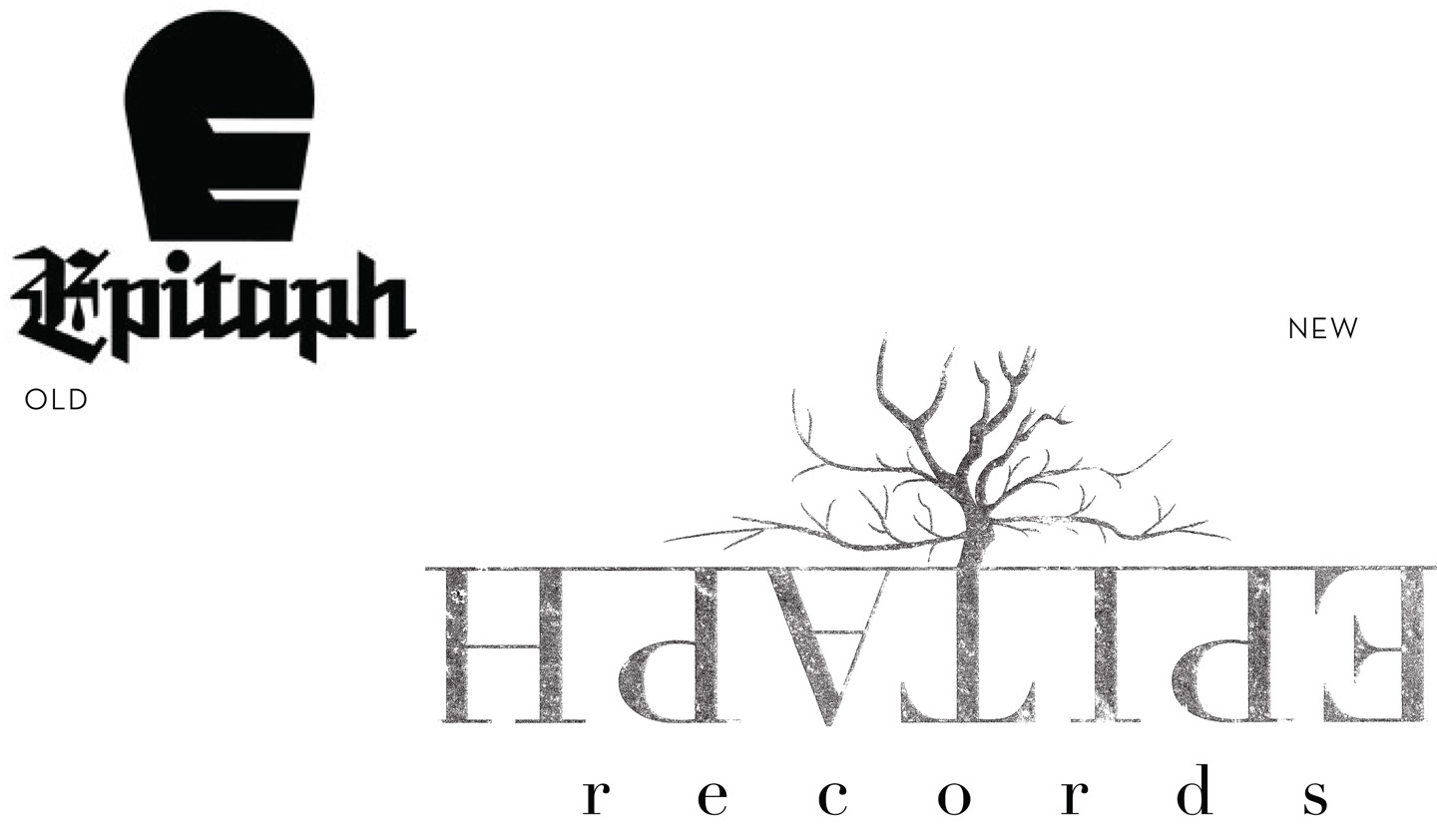


This is a redesign of Epitaph Records' logo and brand. If you'd like to compare the real Epitaph to my redesign, click the old/new logos image and it will redirect you to Epitaph Records' homepage.
My intention was to diversify Epitaph's look, since right now their identity screams heavy death metal, or punk rock, to make their branding system enticing to more genres of music.
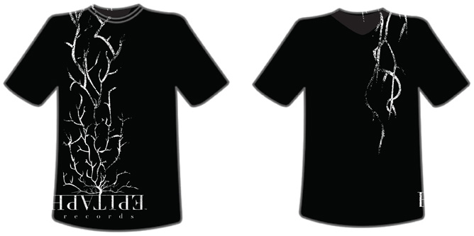
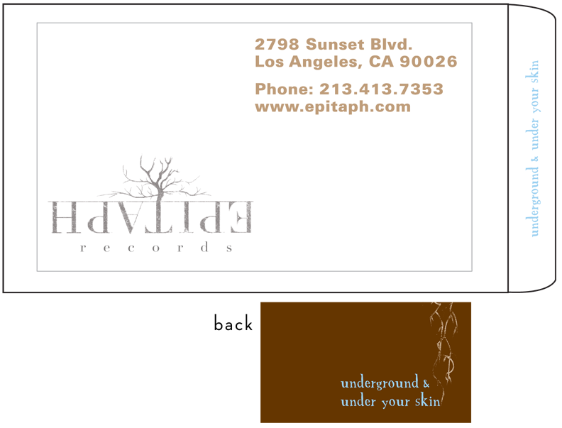
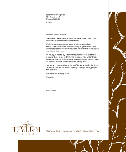
"Epitaph," by definition, is an inscription on a headstone, which makes their current logotype quite fitting, so this was a challenge to say the least. Trying to keep the definition in mind I started by making the name "Epitaph" look grainy, like it had been carved into a headstone. I also used a serif type, which is common on headstones. I created a tag-line for Epitaph reading, "underground and under your skin," to represent the eclectic/underground music of the groups that sign with Epitaph, while telling people it's the type of music that'll stick with them (under their skin). On the flip-side, underground represents being physically underground when you're burried under a headstone. I flipped the logotype upside down as well, to keep playing on underground, etc. The tentacles coming up from the logotype are veins and roots. They are to represent the roots 'underground', and the veins 'under one's skin.' This was then applied to their stationery package and other applications. The business card was placed in a translucent envelope to give the effect of being under a layer of skin! The accent color (sky blue) in some of the applications is to represent the sky, again playing on up and down, under and above. So, on the website the brown bar on the top is to be the ground, while the blue body of the site represents the sky.
All designed images and text © Elissa James 2010