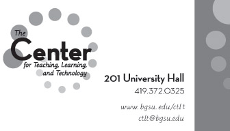
Above: The business card I designed while I was working at the Center for Teaching, Learning, and Technology (CTLT).
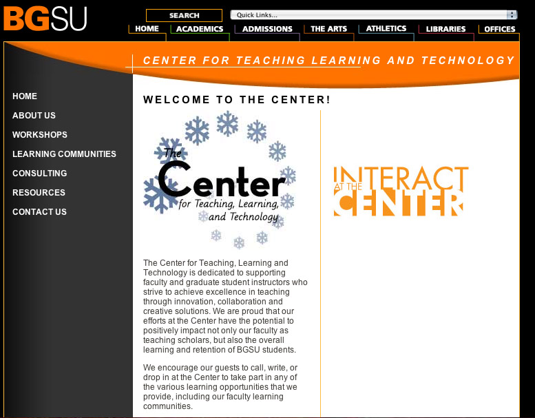
Left: I created a series of icons to replace the circles in the Center logo which represent each season. I then implemented the seasonal logo to the Center website during the corresponding season. This is a view of the winter semester logo.
Left: I created a series of icons to replace the circles in the Center logo which represent each season. I then implemented the seasonal logo to the Center website during the corresponding season. This is a view of the winter semester logo.
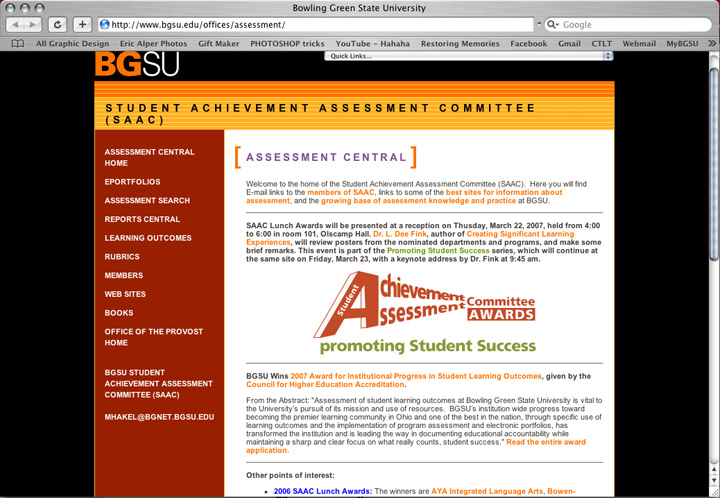
This is a logotype I created for a department on BGSU's campus, that they then implemented on their website and flyers. Yes, the "p" in "promoting" is supposed to be lowercase... the client wanted it that way, to put the emphasis of "Student Success."
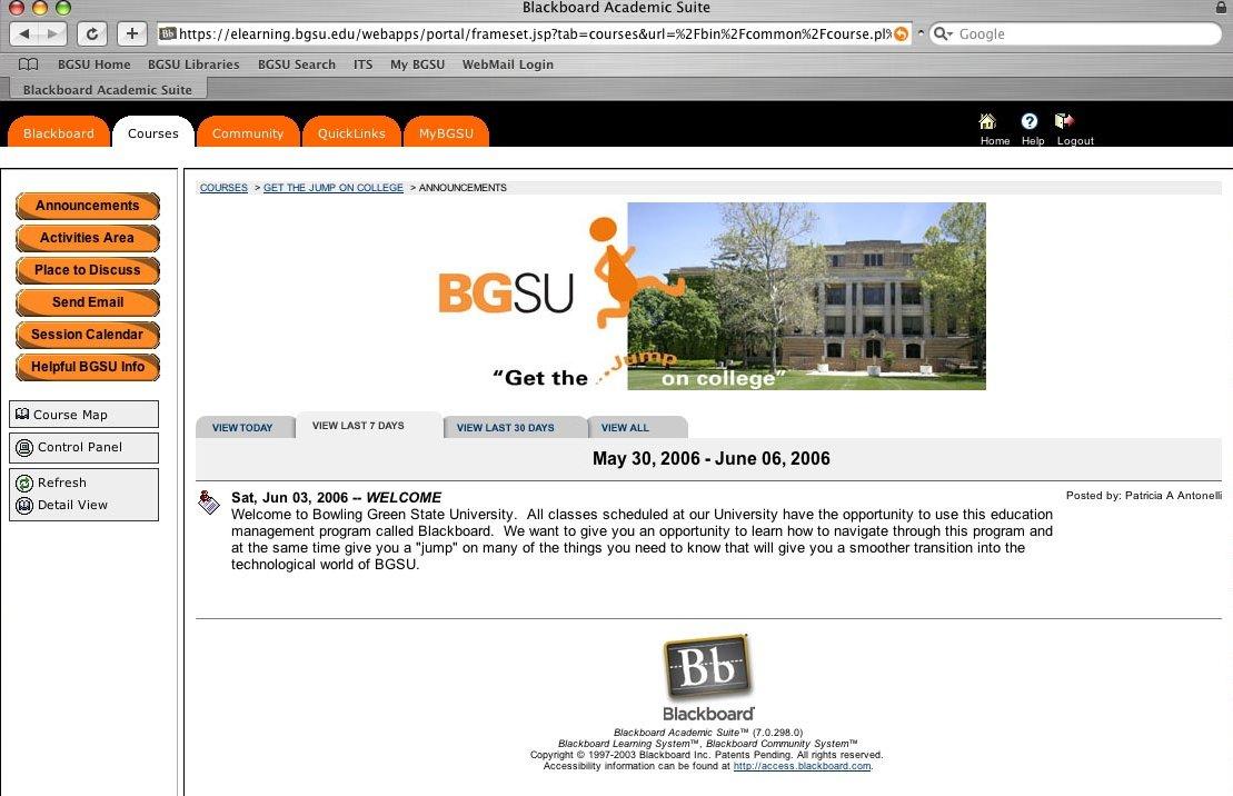
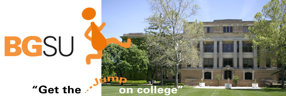
This is a banner I created for my boss at CTLT. She wanted something for a section of BGSU's website geared toward incoming freshman. The little guy that's jumping is an upside-down exclamation point, which is used several times in the BGSU advertising campain, making it recognizable for the incoming students. Also, the photograph is of University Hall, which is a central location on campus, therefore also easily recognizable.
This logotype was created for the Jerome Library on BGSU's campus. It was a collaborative effort between myself and another designer at CTLT. After being given information from the library, I then created the page to the left, and implemented the logotype.
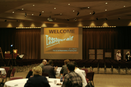
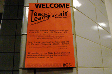
Above is a logotype I created for a fair that CTLT hosted. It was implemented into this presentation, and below I used it, and other information, to make the event signage.
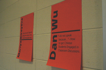
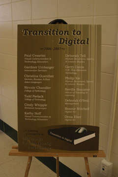
At CTLT we hosted several Learning Communites, that would meet throughout the semester. The Learning Communities were comprised of faculty members and graduate students from a diverse group of departments around campus. I created all of their identities and then implemented them on posters that I designed as well. The overall Learning Community logo is a book, so each individual community has something added to that book (i.e. "Transition to Digital" has a mouse that is plugged into the book). The posters were showcased at events that CTLT held, and we also hung them in our office (as seen, above, right). There were twelve posters in all, and this is only one set. I designed a new set each year I was there.
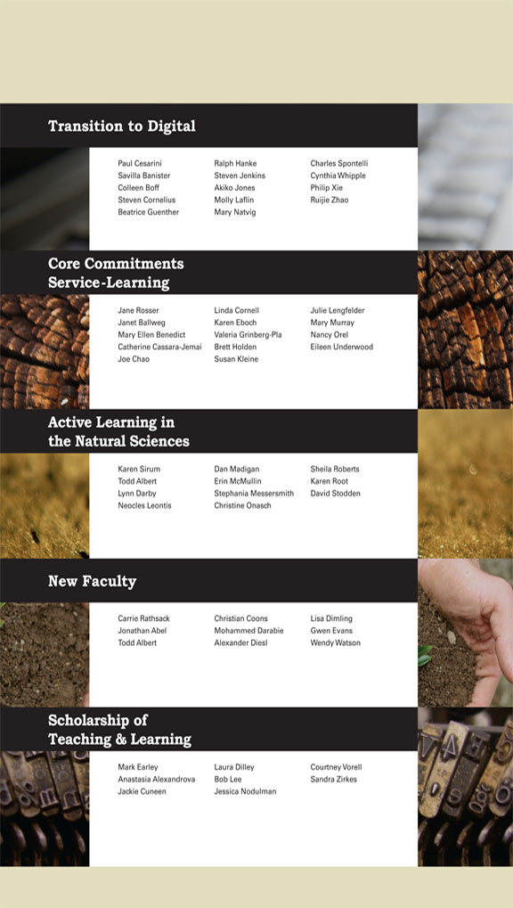
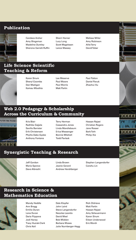
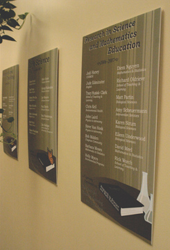
These posters were created to highlight each member in each Learning Community. These were put up on our walls and stayed there the entire year, to promote the communities. Behind each Learning Community is a detail of a photograph that was picked out to represent the community it's behind. For example, "New Faculty" has a photograph of new, topsoil that is growing a baby plant, and there is a hand holding that soil/plant. Like the photograph, new faculty need to be guided by more senior faculty (the hand) and they represent new, budding ideas that they bring to a college campus (the plant).
All designed images and text © Elissa James 2012