
The above card was created for self employed, Real Estate Appraiser, Chris Binkowski. He wanted his card to stand out from others, while maintaining a consistency with the industry. Real estate appraisal is one of the key steps taken when buying or selling real estate. So, I wanted to show Mr. Binkowski's definitive roll in this process, by showing his initials as the building blocks for the house icon on this card. The house won't be complete without the blocks needed to fit into his initials, illustrating that you need Chris Binkowski to appraise your real estate before you can properly buy or sell.

This card was designed for a freelance painter, Jen Patton, who sells her paintings primarily online. The logo was made to represent a butterfly, because it truly captures her personality. The wings are made up of a stylized "J" and "P," to represent the first letter in her first and last name. The colors of the butterfly's wings correspond with the colors of her first and last name, to reaffirm the idea of the "J" and "P." Also, the colors on the front of the card were pulled directly from the back image of her painting, to make sure they compliment each other. The back of the card is a detail of one of her paintings, which is meant to lure potential buyers to her site, without completely giving away the whole painting.
*Click her card to be transfered to her blog.
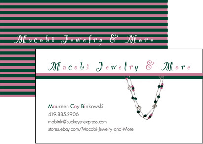
Made for Maureen Binkowski, who sells her handmade jewelry online. The image of the necklace on her card is one of her actual pieces. Color was taken directly from the necklace and implemented on the rest of the card.
* Click her card to be transfered to her online store.

This card was created for Brenda Keller, who sells giftbaskets online. She creates her baskets out of her home in Tucson, Arizona. The colors were chosen strategically to represent the western culture of that area.
All designed images and text © Elissa James 2010